

| 21. Feb. 2000. Tomi Engel | |||||||||||
|
|
|
||||||||||
 |
|||||||||||
Since every user interface is build around (hopefully) few core interface elements and concepts, it seems like a good starting point, if we want to dig deeper, to compare those first.
"Our goal in [the Aqua] user interface was twofold: [...] to give a much more powerful user interface to our pro customers [...] and at the very same time we wanted to make this the dream user interface for somebody who has never even touched a computer before." (Steve Jobs, MacWorld 01/2000)
Every good product follows its own philosophy. Since "form follows function" there usually is a link between the way things look and the way things work ... or at least how they should make people feet the things will work.
 |
 |
 |
| Curved and Enjoyful
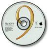
The Mac was designed to be a "nice" guy and make computing accessible to the masses. Friendly, funny UI elements and icons combined with curved designs and simple concepts, as they have been introduced in 1984, made the Mac the computer "for the rest of us". The system gives you a lot of freedom that you can use to turn the system into your personal Mac. However, it was a single user idea, which drove the design and with all the "freedom" it became also very easy to clutter your virtual desktop in the same way like you real one. It should be fun to work with because it is your personal computer, your Macintosh. |
Straight and Productive
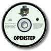
Scientists and business professionals in a networked environment were the target audience of NeXT. The "clean and straight" design philosophy started with the NeXT logo, the original NeXTcubes highly symmetrical outlines and reached even down to the pure object-oriented programming interfaces. Its user interface was much more focused on functionality, network awareness and a clean (some might say "cold but colorful") appearance. This should not be misinterpreted as if Keith Ohlfs artwork was not nice - it still is the most exciting piece of icon and UI design to many people - but it followed a less "playful" approach then the Mac. Productivity in a visually pleasing and clearly organized environment is what might describe OPENSTEP. |
Curved and Productive
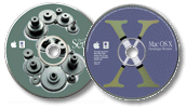
With OS X Apple is aiming at novices and professionals, old Mac users and people who have never used a Mac (or any computer) before ... and sure ... the internet plays a central role as well. The design must be sophisticated, colorful and fresh so that it attracts new customers easily and underlines the power of the entire system. Mac users must feel at home as much as possible but new features need to be included to support the new capabilities of the OS and to give powerusers easy access to them. To some degree it evolves along the same lines like the Apple logo. On the one hand it was simplified down to its pure shape which made it more recognizable and versatile. On the other hand it now comes in many different colors with a fancy translucent shading giving it more details then it had before. |
| This is not about "judging" the environments, but you should recognize that already the very basic design concepts behind the systems have been different and so naturally a number of other concept will be tailored to fit the overall design goals. Personally I am not very happy with the descriptions I have given above, since, as a native German speaker, I feel that I didn't find the right words to describe exactly what I wanted to say, but I hope you got the picture. |
| Hardware constrains
Starting with the processing power of a m68k and limited to small black and white. Support for a one button mouse only. |
Hardware constrains
Megapixel grayscale and truecolor screen powered by m68040 CPUs were the starting point. While the system supports two mouse buttons the UI was designed for single button usage. |
Hardware constrains
Build using megapixel screens and true color capabilities plus the PowerPC G3 processing speed. Main input device is still the one button mouse. |
| Basic Controls
Common controls are displayed in a es keyboard friendly control. |
Basic Controls
The |
Basic Controls
Shares all the usual control widgets but takes the visual appearance to a new level of detail. |
| Documents
Dokuments belong to a certain application and are displayed in windows. Windows can live in multiple levels and have different shapes but only one window can show its focus. They can be collapsed into their titlebar. |
Documents
Documents do have a Windows can be either inactive, main or key. Panels sometimes are only visible when the app is active. General concept for Preferences and Inspectors. Windows can be minimized and follow the style of the application tiles. |
Documents
Adds default dokument proxies, |
| Menubar
The menu offers a lot of addition functionality (time, app switcher, etc.). |
Context menus and Tiles
Running applications are represented as tiles on the screen following the concept of the Dock. |
Menubar
The menu offers a lot of addition functionality (time, app switcher, etc.). |
| Control Panels
Alert boxes are modal to the whole system. They show an icon representing the type of alert. |
Inspectors
Alertpanels show the icon of the related application and keep the user from continuing to work with the affected app. General concept for Preferences and Inspectors. |
Attached Panels and Drawers
Adds the concept of "dokument" modal panel which can be attached to the affected window and only block its operation. |
| Customizable Appearance
Many aspects became customizable and users could choose between themes to change the look of the entire system. |
Customizable Appearance
And now... |
Customizable Appearance
And now... |
| Desktop
On the Mac you can drop files and applications on your desk and keep them right at your fingertips. |
Dock
The dock will hold your applications. |
Desktop with dynamic Dock
.... |
| Finder
Finder opens new windows for each opened folder where you can postion te enclosed files freely. |
Workspace
Workspace allows you to browse files but usually will keep your action inside a single window. |
"CyberFinder"
Apple will propably integrate CyberDoc technologie with the Finder and add the browsing idea and some background processes panel similar to the Workspace. |
We would recommend that you start your tour with the introduction to the common interface controls


